Cardinal Points
Brand creation
Background
Nestled in the rugged landscape of Dartmoor, two lifelong friends set out to brew their own beer. What started as small kitchen batches quickly gained a devoted following, leading them to build a microbrewery in their backyard. As demand surged, so did their ambitions—they needed a brand as bold and distinctive as their beers.
Scope of Work
Naming
Logo
Packaging
Advertising Concept
Tone of Voice
The Challenge
With the craft beer market more saturated than ever, standing out and sparking curiosity among potential patrons was no small feat. The brand needed a visual identity that was not only eye-catching but also deeply rooted in the brewery’s ethos.
Strategic Approach
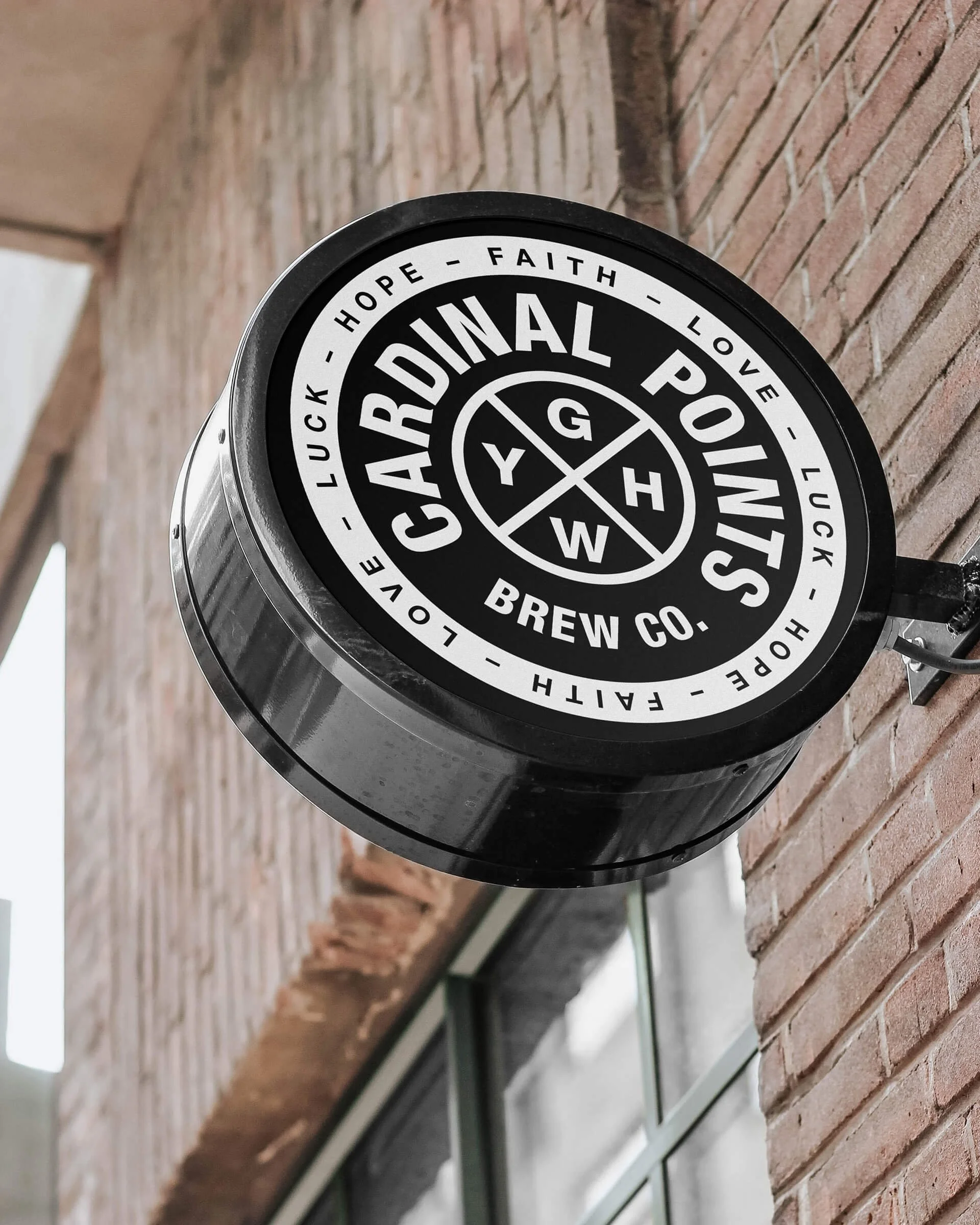
Every beer starts with the same four essential ingredients: grains, water, yeast, and hops. The art of brewing lies in balancing these elements to create something exceptional. These four ingredients became the brewery’s guiding force—its Cardinal Points. This philosophy shaped the brand, reinforcing their passion for craft and precision.
Design Solution
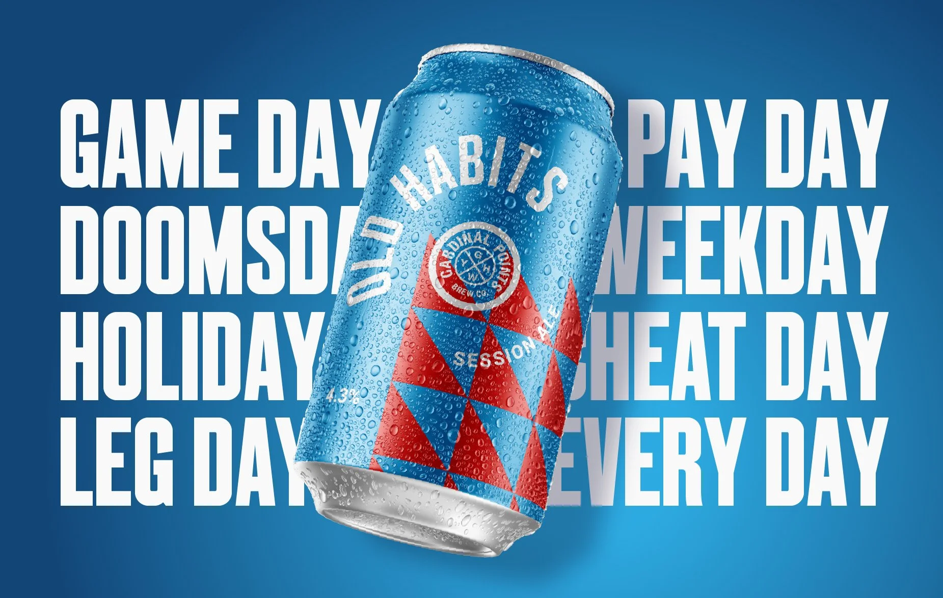
The logo reflects the brewery’s honesty, integrity, and unwavering commitment to its craft. The packaging is as bold and uncompromising as the beers themselves. Each can is designed to be strikingly distinctive, amplifying the personality and uniqueness of every brew. A modern, dynamic aesthetic infused with an undercurrent of rebellion ensures the brand leaps off the shelves—demanding attention and leaving a lasting impression.


