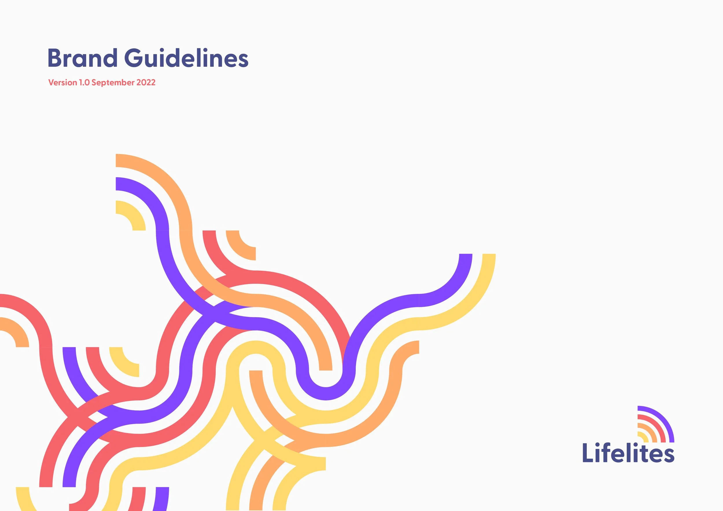
Lifelites
Rebrand
The Challenge
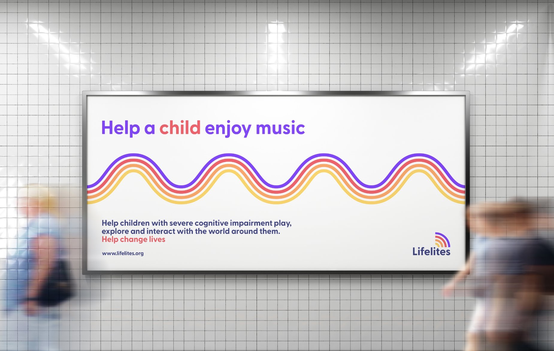
The brief was to to re-invent the Lifelites logo and brand styling to authentically represent the charity and help create better engagement with audiences. The brand needed to shine in the children’s charity sector and reflect the ambitions of the new management team.
Strategic Approach
Lifelites transforms spaces into vibrant, imaginative environments where children can explore, express, and thrive. Our aim was to reflect this spirit in the brand—capturing a sense of joy, creativity, and wonder—while elevating Lifelites’ profile as a leading voice in the children’s charity sector.
Outcomes & Impact
The refreshed brand helped strengthen engagement with partners across the sector, paving the way for new expansion opportunities projected to extend Lifelites’ reach by 10%. Within just a few months, the new brand activity attracted over 8,000 new website visitors and generated £3,000 in donations from first-time supporters.
Background
Partnering with every children’s hospice in the UK, Lifelites are a charity who provide children with life-limiting conditions the chance to communicate, play, be creative, and control something for themselves by harnessing innovative technology.
Scope of Work
Logo
Website
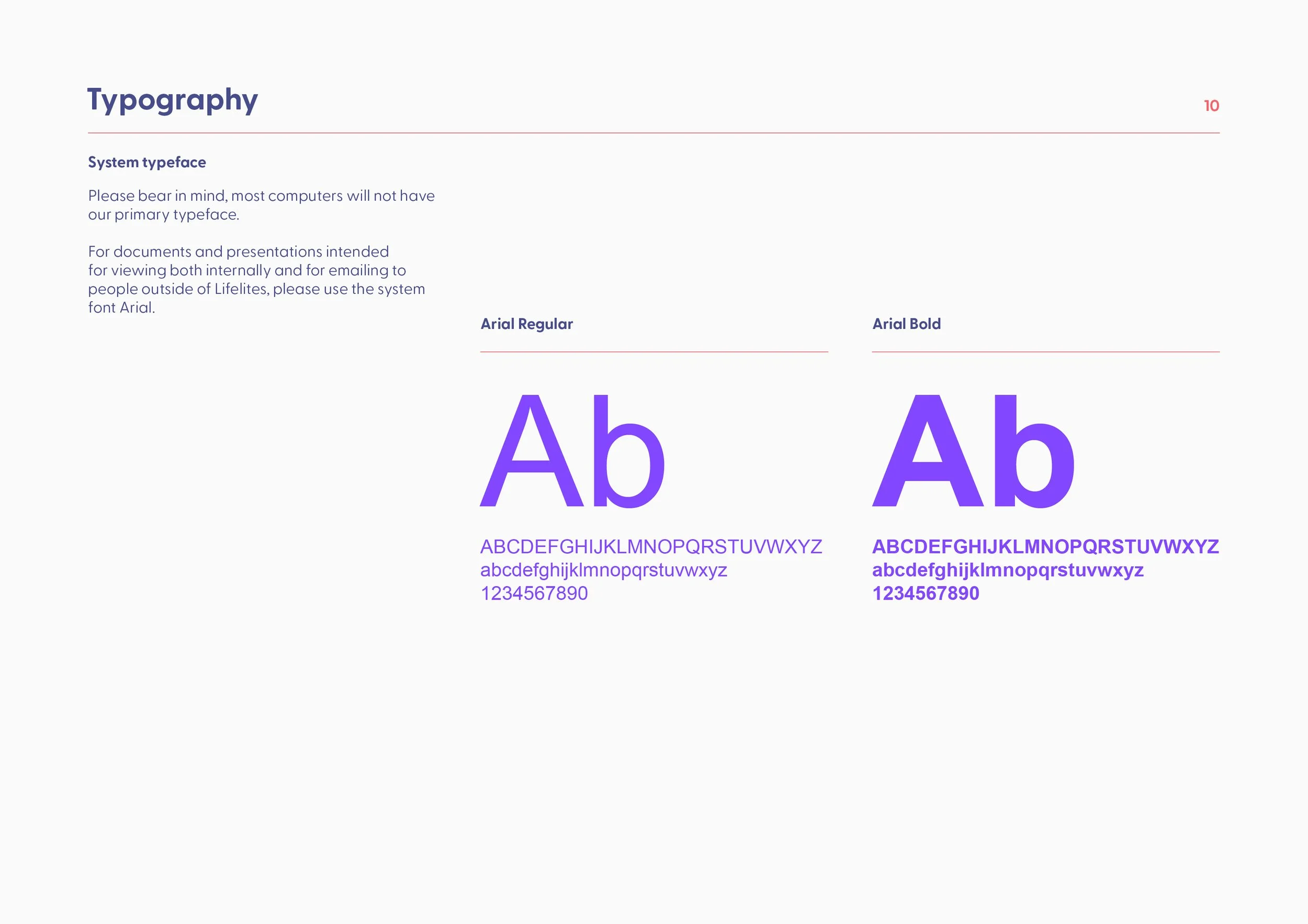
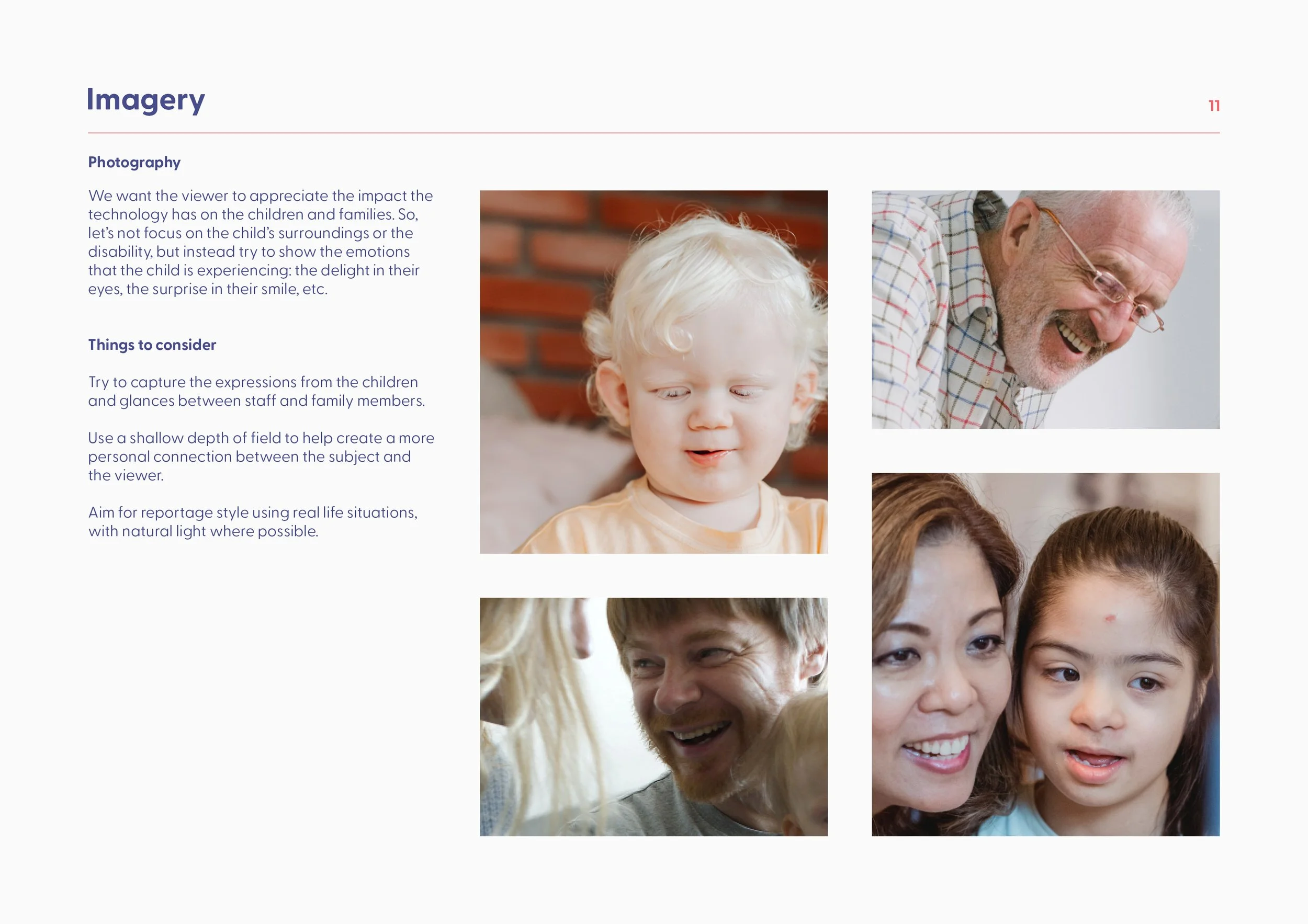
Visual Identity
Brochure
Tone of voice


“The new logo, visual identity and tone of voice has been described as ‘exemplary’ by sector partners in terms of a positive representation of children’s palliative care.
This has helped to cement engagement with partners across the sector, helping to facilitate new partnership development conversations with Together for Short Lives, the Global Treehouse Foundation and other cross-sector partners.”
Rob Lightfoot
Chief Executive