Welcome Family Holiday Park
Rebrand
Background
Situated a stones throw away from the golden beaches of Dawlish Warren and stunning nature walks along the Exe Estuary, Welcome Family Holiday Park are a 4 star park holiday provider.
Scope of Work
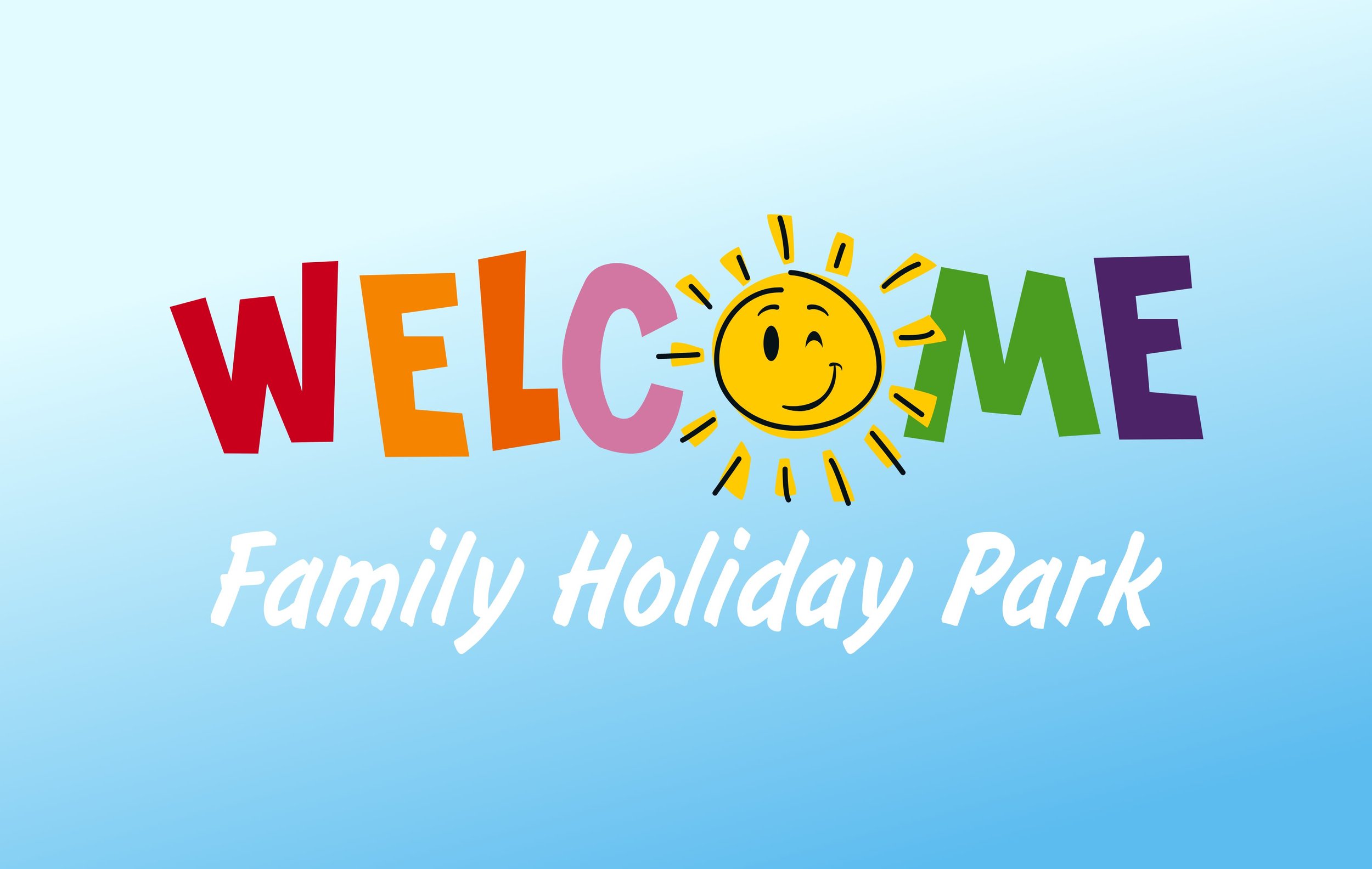
Logo
Website
Brochure
Illustration
The Challenge
With impressive facilities, exceptional entertainment and a welcoming atmosphere it was clear why they enjoyed a loyal customer base. Unfortunately the park’s brand was aging and struggling to accurately represent their personality and high quality offer.
Design Solution
While showing deference to its origins the new contemporary mark has been stripped of any unnecessary detail and embodies the company motto, "where the fun always shines".
The magic ingredient that keeps 2 out of 3 families returning each year to Welcome is fun. It’s at the core of everything they do. To amplify this, an endearingly hectic, fun-loving family of animals who invite chaos and calamity at every turn were created. These dysfunctional characters feature throughout the collateral; you may even spot Whizzy, Dizzy, Myrtle and Doug wandering around the park!


“As a small independent company in a market dominated by many large corporate UK holiday companies, it is vital that we demonstrate our individual approach.
The rebrand to modernise our identity and reflect the nature of our product has made a great difference. We now enjoy an extremely high return rate of satisfied and loyal customers, many of whom would not have been drawn to us in the first place without the high level of design direction provided by Matthew.”
Alistair Roberts
Director